Viewing entries in
"Design"

Clear Sailing

5 Comments

Clear Sailing

The JLC Show is a great opportunity to talk to framers and carpenters. Sometimes I get an entirely new perspective on products that I think I already know something about. For example, I always considered the open web design of floor trusses a big plus for accommodating the trades that will work around the structural components. Then, I talked to one framer who said he thought I-beams are more flexible for the trades because you can “freelance” with them – meaning you can cut wherever you want (more or less) to accommodate your pipes or duct work or whatever else you’re working on. If that’s a general perception, then in my book, that’s two points for I-beams… less expensive and you can “freelance” with them.

Cutting in the Field

I said to this framer, “Well, true, you can cut more or less wherever you want to, but you actually have to do the cutting, don’t you? With floor trusses – there’s no need to cut anything.” His reply: “I don’t have to do the cutting – it’s all those other trades that have to worry about that.” At that point I considered how significant the opinions of electricians or plumbers was in the decision of what kind of floor system to use. Not very, I thought. Well, what might make floor trusses “better?”

A Proposal

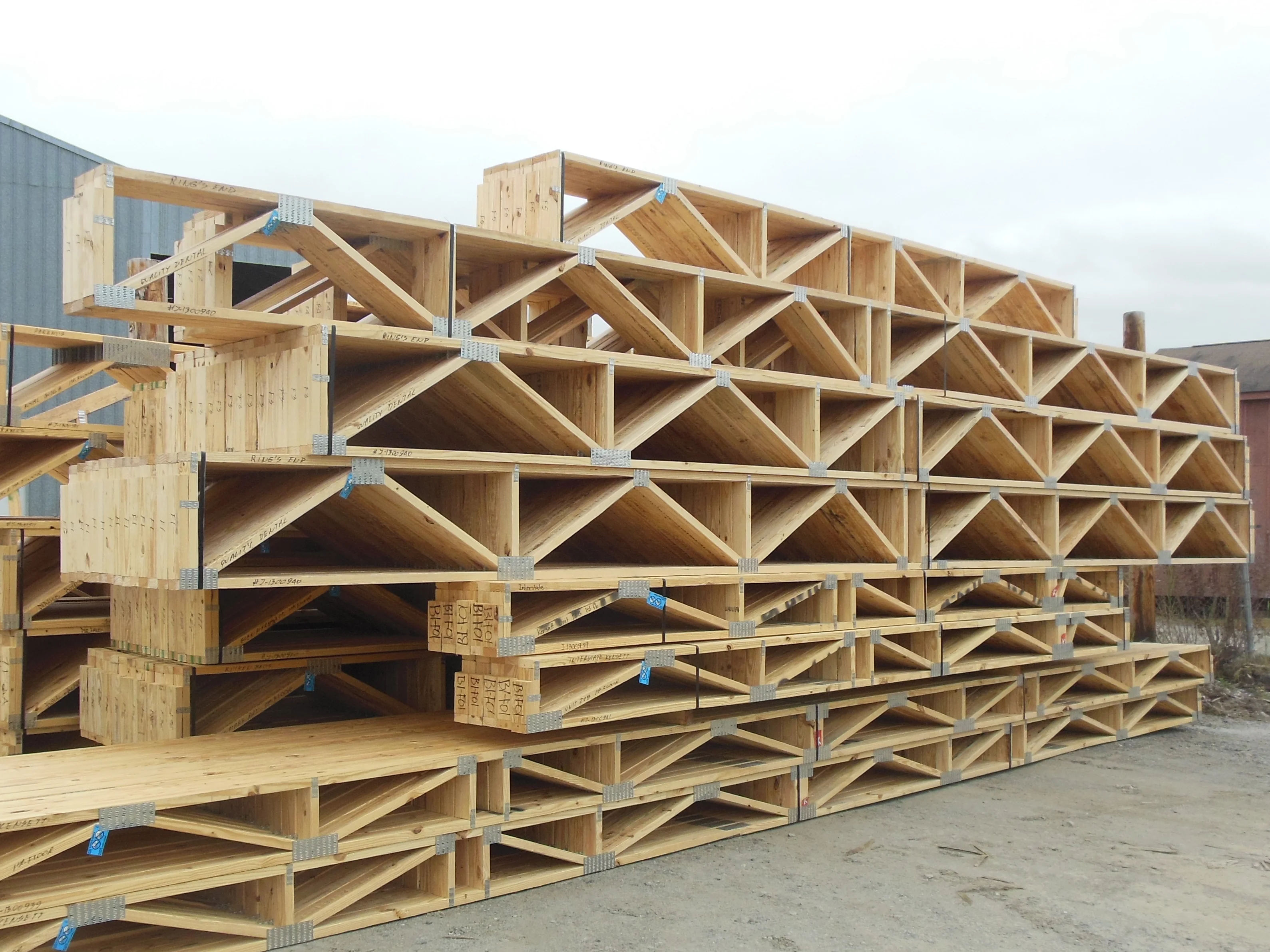
What would happen if every time anyone went to a job site using floor trusses they were able to see right through the entire system because all the webs were aligned? Not just some floor truss jobs, but EVERY job. What if using floor trusses meant “every web (possible) is aligned throughout the floor system – always.” What if the product came to be defined not just an “open web product,” but defined as always being an entire system designed to promote the freest access possible, with no cutting? If trusses are going to be considered a “premium” product anyway (price-wise), why not take the trouble to really differentiate the product – emphasizing what that product does best? If every time a builder ordered a floor truss job, he could be assured that he could walk the site after installation and look right through the floor system and see everything aligned, do you think that might influence him to order them more often? Once the trades came to understand that floor trusses meant “clear sailing,” do you think they might be willing to bid their work at lower cost than on a job where they knew they would have to cut holes through dozens of I-beams?

You Could Go it Alone, Too

Although I like the idea of the truss manufacturers of a given area getting together and agreeing to “all pitch in” and make this proposal a reality, you could ‘go it alone’ for now and offer a floor truss system that is “Certified ‘Clear Sailing’” – certifying to the consumer that your floor truss job has all the webs aligned as much as possible. Although this could be a differentiator, I think the greater value would be the ‘collective’ promotion of the product itself when everyone gets on board.

Although today there is a considerable amount of design work needed to create a “clear sailing” floor system, it needn’t always be this way. The past ten years has seen $100’s of thousands of dollars invested in software tools to automate wall panel design – blocking, stud alignment, customization of junctions, etc. Given enough interest on the part of component manufacturers, tools to automate ‘clear sailing’ floor systems could be the next ‘big thing.’

5 Comments

Presentation Drawings

Comment

Presentation Drawings

That “What would we do without it?” web site Wikipedia says a presentation drawing is used “to develop a design idea into a coherent proposal, to communicate ideas and concepts, to convince clients of the merits of a design, (and) to enable a building contractor to construct it...” Presentation Drawings are so much a part of our world, it’s easy to see why they wouldn’t get a lot of attention. But they are important, and it’s worth taking the time to talk about why.

Presentation Drawings as a Form of Communication

I’ve mentioned before the work of Edward Tufte, who has done a lot of research on the communication of information. In his book Beautiful Evidence he shows many examples of documents rich in information, containing little or no “fluff,” and provide the consumer the freedom to take in the information in their own way. One of Tufte’s favorite examples of this type of communication is the basic road map, which he points out is so good in part because “we’ve been perfecting it for several hundred years.” Like a roadmap, presentation drawings can elegantly communicate many different things in the same space.

What’s Being Provided

By showing location and labeling the products to be provided, a presentation drawing communicates what will and will not be provided. Takeoff sheets presented in a tabular format can describe the same information, but they cannot tell a customer ‘at a glance’ what areas will be framed and what, if any, are “by others.” With a quick look a customer can be reassured that the entire structure is going to be framed.

How the Framing Will be Done

The details of “how we are going to do this” are laid bare by the presentation drawing. This enables us to communicate, “We’ve got this figured out, and here is our proof.” It also provides the framer with a “how to” guide for setting the trusses.

Reveal the Assumptions We’ve Made

By creating notes and including section details, we can point out tricky framing situations and expose certain assumptions we’ve made in our framing design. This is crucial in order to avoid delays or misunderstandings during the erection process. It’s worth restating the obvious that pictures are better than words for communicating many things. For example, showing a picture of the cathedral truss spanning a given area is less likely to lead to a “surprise” for the customer than simply writing “volume ceiling” on the layout.

Who We Are

We can spell out what company did this work, who we are, and who you should contact if you have questions. By the quality of our work, we communicate how professional, how meticulous, how helpful we are. Alternately, we can communicate the opposite by presenting sloppy or inconsistent work. If your customer on one job receives a professional, complete presentation drawing on 24” x 36” paper and the next time receives a sloppy, incomplete layout on 8½” x 11”, what are they likely to think about your company? I might think, “Wow, the quality of the work I get from these guys really depends on which designer I get.”

Keep it Clean

“Fluff” is those things that, if we left them out, would not reduce the informational content. Avoid adding things simply to make the layout “pretty.” Color can be used to great effect to make information “stand out,” but it can be also used simply to make things look attractive. Color, like special effects in a PowerPoint presentation, can take attention away from the information. Let the information always have center stage.

Keys to Success

The Presentation Drawing is the most important piece of visual communication we provide with the order. It should be complete, detailed, and consistent. The elements, that is, “What we always include,” need to be understood by all. At a glance we should be able to tell if any one of these ‘essential’ elements is missing. Periodically, the list of elements should be reviewed, and new ones added if experience has shown that their inclusion may prevent problems from repeating themselves. You will inevitably have some people on your staff that are better at this form of visual communication than others. Take their natural abilities and incorporate their “art” into the “science” of creating presentation drawings that communicate the very best about your company to your customers.

Comment

And see? TPI-2007

Comment

And see? TPI-2007

Two new building codes are now in the pipeline

Within the next year many local and state jurisdictions will start to adopt and enforce the 2009 International Building Code (IBC 2009) and the 2009 International Residential Code (IRC 2009). These new codes reference, and thus require, the use of a new standard called ANSI/TPI 1-2007 (TPI-07). The most significant changes required by the new standard are in plating, but there are changes that affect lumber design as well.

Because of the new and modified plating checks, some plate sizes will increase, although this will be greatly influenced by the type of trusses you design. One estimate is that plating square inches will increase an average of 3% to 5%, and lumber costs will increase perhaps 1% over current design standards. Changes to individual truss designs may vary greatly.

Why should plates get bigger at all?

If you are an old truss designer like I am, you might assume that “everything there is to know about the analysis of trusses is known.” But that isn’t the case. Knowledge about plating and lumber design grows over time. As this happens, and the standards are reviewed, there are areas where certain assumptions of the past are replaced by the new knowledge gained. Is that ‘new knowledge’ “right,” and the previous knowledge (standards) wrong? Not necessarily – but both are based on ‘the best available knowledge at the time,’ and governed by the fact that each standard represents a consensus of those that participated in the creation of the standards. Each new standard therefore “tightens” areas that were based on assumptions, and in doing so frequently results on more stringent rules. I'm not sure it is widely understood that the development of new standards is not a “closed” process. In fact, plate companies, component manufacturers, academia, building officials, model code officials, consulting engineers and other groups in the US with an interest have participated.

What Type of Joints Will be Most Affected?

Because of more stringent checks in TPI-07, joints that plated previously (under the TPI-02 standards) may require a larger plate and in some cases may no longer plate. Those most affected are corner joints, splices, and peaks. Here are some suggestions to help:

·         A corner joint, such as a raised heel with vertical, may benefit from running the vertical through to the bearing or having a 2x6 (as opposed to a 2x4) end vertical.

·         A design option that analyzes the pitch breaks using a semi-rigid model will help a lot with some trusses. (In MiTek Engineering software, this is located in Design Info, Fixities.) This feature reduces the amount of moment at the perimeter break joints for which the program is designing. Using Semi-Rigid Joints will generally increase the stresses on the lumber while decreasing the moment on the plates. This will typically decrease the plating requirements, but it may increase (we think this will be minimal) the lumber size or grade.

·         With splices, an option to “Use solid bar tension values” (MiTek = Plating Options) will help. The downside to using this feature is that it requires stringent quality control. You must make sure the solid bar section of the plate (as opposed to the section through the plate with slots) is centered over the splice line. There is only an eighth of an in. (1/8-in.) positioning tolerance along the plate's length and the rotational tolerance is very limited (about 2 degrees). Although not recommend to use this feature as a rule, it may allow you to plate some joints that you could not otherwise.

·         Reduce the length of a panel that is next to the peak or hip joint. Doing so reduces the moment at the joint so that a smaller plate may be used.

·         Expanding your plate inventory to include more 18g high strength plates.

The use of these techniques may eliminate a large amount of the plating increases that we would see from TPI-07 using “out of the box” defaults.

Comment